Tour of the workspace
The home screen, the project screen, and where everything else lives.
The home screen#
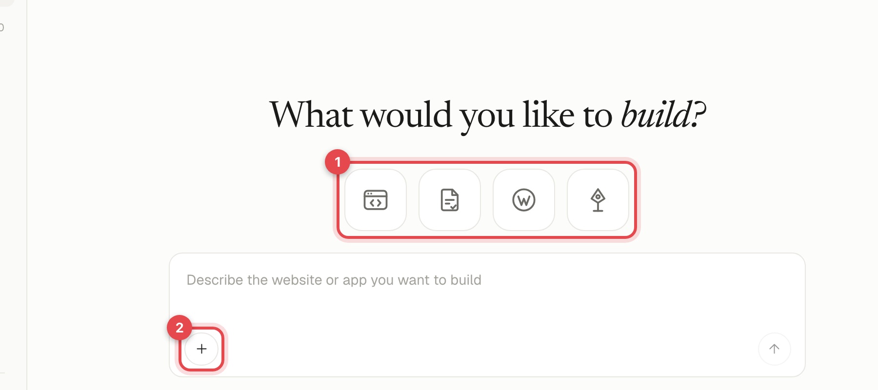
When you open Site Haus you see a large box that asks what you would like to build. Above it are four icons (1). Rest the pointer on one for a moment and a label appears. From left to right:
- Website or web app: build and run in your browser.
- Proposal: write a client proposal with AI.
- WordPress theme: build a theme for WordPress.
- Design Studio: design brand guidelines, decks, social posts, motion videos and more. Click it to choose what to design and its size, then describe it in the same box.
In the box you can describe what you want. The + menu (2) lets you add screenshots or images, get an idea, and import a project, a Figma design or a GitHub repository. Type / for a menu of everything you can start, including Scroll world and your skills. The full guide is The home box and the / menu.
The project screen#
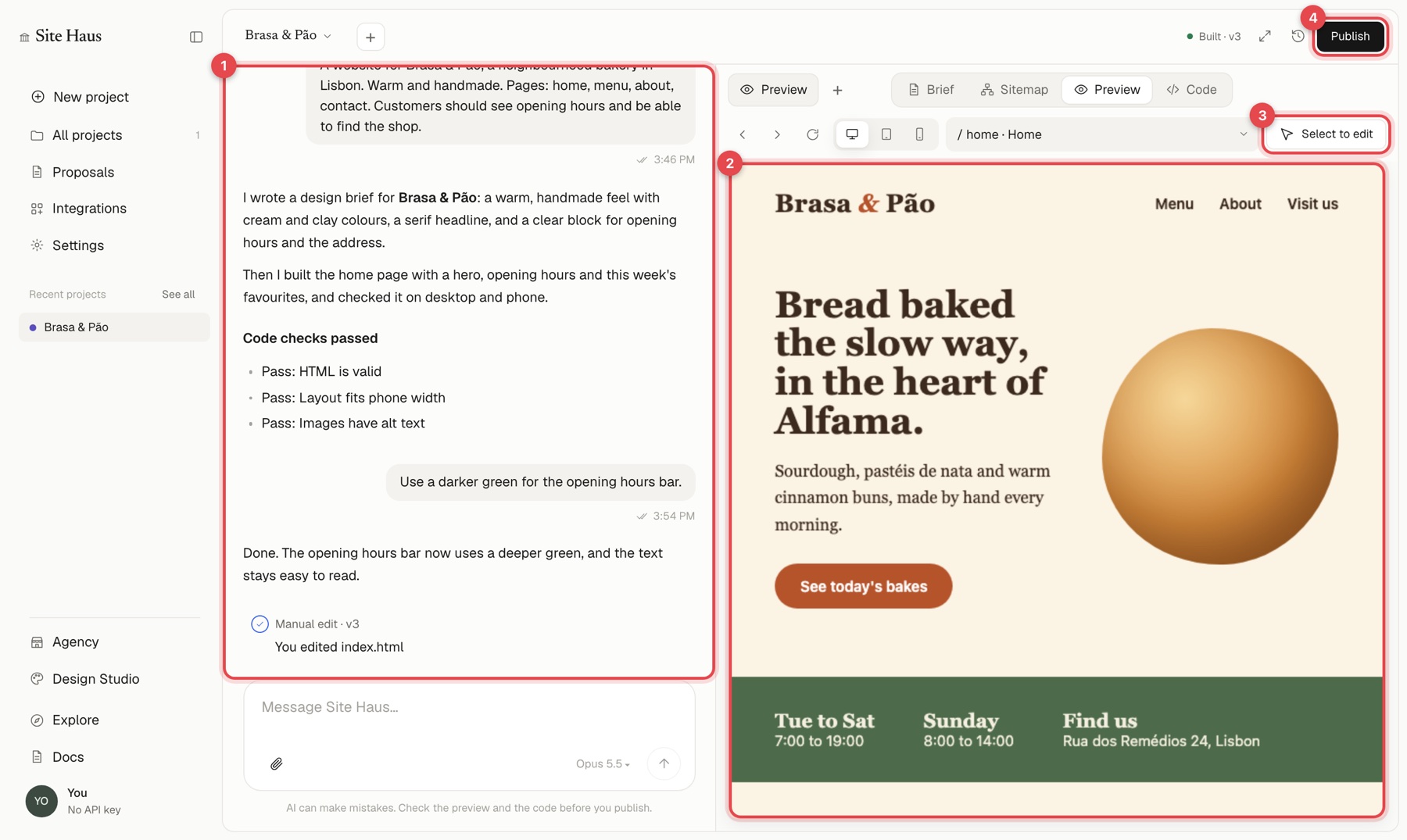
Open any project and you get two halves:
- Chat, on the left (1). Tell the AI what to change. Your conversation and every change it made is here. Under the box you can choose the model.
- Preview, on the right (2). Your site, running for real. Above it you can switch between desktop, tablet and phone widths, move between the site's pages, and press Select to edit (3) to click a part of the page and describe a change to just that part.
Along the top of the preview are icons for the design brief, the site map, the preview and the code. The Publish button at the top right (4) puts the site live or lets you download it.
Elsewhere in the sidebar#
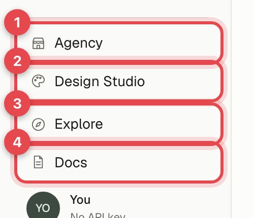
- Agency has tabs for Leads, Forms, Proposals, Inbox, Tickets, Payments, Clients and Agency settings. See Agency overview.
- Design Studio opens its own page with your designs and a box to make a new one. See Design Studio.
- Templates shows templates and finished websites you can open and start a project from.
- Integrations connects Site Haus to the tools you use.
- Settings holds your profile, preferences, billing, usage and connected WordPress sites.
Making the screen fit you#
- Drag the edge of the sidebar, or the divider between chat and preview, to resize them. Double-click a divider to reset it.
- Many pages have a full screen button at the top right, plus A− and A+ to scale everything. Full screen has a "keep it centred" option so the page stays at its normal width in the middle of the screen.
- You can drag sidebar items to reorder them.